In-Class Exercise: Wright-Fisher Simulation
The Wright-Fisher model is commonly used to investigate the effect of genetic drift: random fluctuation of alleles from generation to generation caused by a finite population size. In this model, we assume:
- Constant population size
- Everyone reproduces once per generation, at the same time
- No selection
- No mutation
- Random mating
We can think of Wright-Fisher as modeling an allele that is evolutionarily neutral.
Since random effects are the only thing changing the frequency of an allele from generation to generation, we can simulate the change frequency from generation by sampling from the binomial distribution. The binomial states that the probability of observing $j$ alleles in the next generation is:
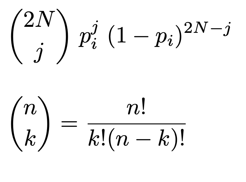
with N as the population size and i as the current allele frequency. Note that the quantity we care about here is 2N: the number of chromosomes.
The easiest way to draw from the binomial distribution is to use the function np.random.binomial(n, p), where n is the number of trials and p is the probability of success.
Exercise 1: The Wright-Fisher Model
In the space below, create a function that implements the Wright-Fisher model. Your function should accept two arguments:
- a starting allele frequency
- the population size
Your function should run until one of the two alleles reaches fixation (i.e., your allele frequency hits 0 or 1).
In each generation, your function should take the current allele frequency and generate the allele frequency of the next generation by sampling from the binomial distribution.
Your function should return a list containing the allele frequencies at every generation, including the first and last generations.
Run your function with any starting allele frequency and a population of at least 100. Print the number of generations it takes to reach fixation.
Using that same data, create a plot of allele frequency over time throughout your simulation. I.e. the X axis is the generation, the Y axis is the frequency of your allele at that generation.
Exercise 2: Multiple Iterations
Because sampling from the binomial distribution is random, the behavior of this model changes every time that we run it. (To view this, run np.random.binomial(n, p) a few times on your own and see how the numbers vary). Run your model repeatedly (at least 30 iterations) and visualize all your allele frequency trajectories together on one plot. Remember that you can lines to a matplotlib figure using a for loop.
Run your model at least 1000 times and create a histogram of the times to fixation. If you want to see the distribution of times to fixation, this is an effective way of doing so.
Exercise 3: Effect of Population Size and Starting Allele Frequency
We can use our model to investigate how changing the population size affects the time to fixation. Pick at least five population sizes greater than or equal to 50. For each population size, run the model at least 50 times and find the average time to fixation. Keep your allele frequency constant for all runs. Create a scatter or line plot of population size vs. average time to fixation.
We can do the same for allele frequencies. This time, pick a population size and vary the allele frequency. Run at least 10 trials for each allele frequency. If your this takes a while to run, decrease your population size. For me, 1000 individuals and 10 trials per allele frequency ran fast enough.
Basic Exercise: Intepretation of Data
Answer one of the two questions below 3 times (any combination works - you can do 3 plots, 1 plot and 2 assumptions, etc.).
- For any plot, explain the results you see. What might be contributing to it? What does it mean biologically?
- For any assumption in the Wright-Fisher model, how might changing that assumption affect the result? How might nature and biology violate these assumptions?
Grading:
- Exercise 1:
- 1 pt. Wright-Fisher function
- 1 pt. Number of generations
- 1 pt. Plot of allele trajectory
- Exercise 2:
- 1 pt. Plot of multiple allele trajectories
- 1 pt. Histogram of time to fixation
- Exercise 3:
- 1pt. Plot of population size vs. time to fixation
- 1pt. Plot of allele frequency vs. time to fixation
- Exercise 4:
- 3pt. Short written answers to three questions
Advanced Exercise: Wright-Fisher with Selection
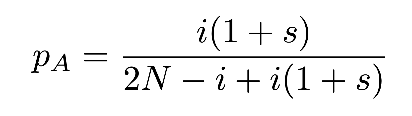
Currently, the probability that an allele will be passed down to the next generation (p) is determined entirely by the frequency of the allele in the current generation. To introduce selection, we need to modify this probability by a selection coefficient, $s$. An allele with positive $s$ is favorable, and an allele with negative s, while alleles with s = 0 are neutral. The formula for p for allele A, given i copies of allele A and a selection coefficient s is:
Create a modified version of your Wright-Fisher function which can also take a value of s as an argument. Try running multiple iterations of this function and plotting allele trajectories and fixation times. Try using different values of s - for a concrete example, lactase persistence, or the mutation allowing us to drink and digest milk into adulthood, has a selection coefficient around 0.01 to 0.03.
How does introducing a selection coefficient impact the time to fixation? How does it change the likelihood of an allele reaching fixation or becoming extinct?
Advanced Exercise: Heatmaps
In the basic exercises, you investigated the effects of changing starting allele frequency and starting population size. We represented these effects individually as line plots. If we want to represent everything together in one figure, we can use a heatmap.
Generate a list of population sizes from 1000 to 10000, with a step size of 1000. Also generate a list of starting allele frequencies from 0 to 1, with a step size of 0.1.
For each combination of population size and allele frequency, run ten trials of your Wright-Fisher simulation. Save the average time to fixation. Plot as a heatmap.
Advanced Exercise: Average Allele Frequency
In Exercise 2, you created a plot of allele frequencies over time. One way to better understand the overall behavior of this model is to plot the average of the trajectories. Run at least 30 iterations of the Wright-Fisher model at a starting allele frequency not equal to 0.5 and then calculate the average allele frequency across all runs for each generation. Plot it in a different color. Consider making all other lines more faint (look into the alpha parameter of plt.plot()). Consider drawing a horizontal line at your initial allele frequency (look into the plt.axhline() function for this).